

User Experience Design Best Practices | Boost Your App
Table of Contents
In a crowded digital marketplace, a visually appealing product is no longer enough. The critical difference between an app that's used once and one that becomes indispensable lies in the quality of its user experience. A seamless, intuitive, and accessible design not only delights users but also drives tangible business results, from higher conversion rates and improved retention to stronger customer loyalty. When users can accomplish their goals effortlessly, they are more likely to return, recommend, and invest in your product.
This guide cuts through the noise to deliver a curated roundup of the nine most critical user experience design best practices you need to master. Whether you're a startup founder aiming for a successful launch, a product manager refining a feature, or a seasoned designer seeking to elevate your craft, these principles provide a robust framework for building products that users genuinely love. We'll move beyond abstract theory to explore each practice with specific, actionable tips, real-world examples, and clear implementation details. This article is your blueprint for turning good ideas into a superior and competitive user experience.
1. User-Centered Design (UCD)
At the heart of all effective user experience design best practices is the philosophy of User-Centered Design (UCD). This isn't just a step in the process; it's an overarching methodology that puts the end-user at the forefront of every decision, from initial concept to final launch and beyond. UCD demands that you move beyond assumptions and immerse yourself in the user's world to understand their needs, behaviors, and motivations.
The core principle is simple: design for the people who will actually use the product. This iterative process involves a continuous cycle of research, design, and testing. For instance, Airbnb continuously refines its booking flow by analyzing user behavior and feedback, ensuring the path from discovery to confirmation is as seamless as possible. Similarly, Amazon’s one-click purchase feature was a direct result of understanding the user's desire for a frictionless checkout experience.
How to Implement User-Centered Design
To successfully apply UCD, focus on empathy and evidence-based decision-making. Start by creating detailed user personas and journey maps to build a shared understanding of your audience. From there, your team can engage in rapid prototyping to quickly visualize and test ideas.
Key actionable steps include:
- Conduct User Research: Use methods like interviews, surveys, and contextual inquiries to gather qualitative and quantitative data directly from your target audience.
- Iterate Based on Feedback: Implement regular usability testing sessions with real users and create feedback loops to inform design changes.
- Foster Collaboration: Ensure insights are documented and shared across all teams (design, development, marketing) to maintain a unified, user-focused vision.
The following concept map illustrates the interconnected pillars that support a successful UCD strategy.
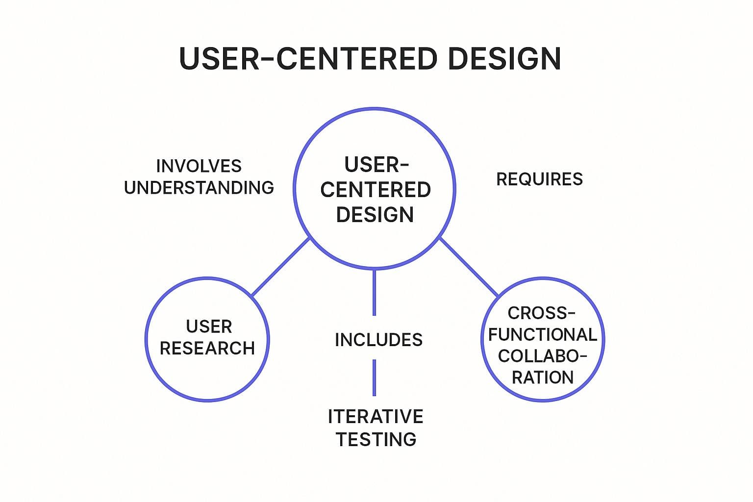
This visualization highlights how User Research directly informs and validates the entire design process, while Iterative Testing and Cross-functional Collaboration ensure the final product truly meets user needs.
2. Mobile-First Responsive Design
In an era where mobile browsing has surpassed desktop, a Mobile-First Responsive Design approach is a non-negotiable user experience design best practice. This strategy reverses the traditional "graceful degradation" model by designing for the smallest screen first and then progressively enhancing the experience for larger devices like tablets and desktops. This forces designers to prioritize core content and functionality, resulting in a cleaner, more focused, and performance-optimized experience for all users.
The core principle is constraint-driven innovation: by starting with the most limited environment, you make deliberate choices about what is truly essential. For instance, Spotify’s interface maintains a consistent and intuitive user journey whether you are on their mobile app or desktop client. This approach ensures that critical features like search, library access, and playback controls are always front and center, regardless of the device.
How to Implement Mobile-First Responsive Design
To successfully apply this methodology, your team must shift its perspective from "what can we add?" on desktop to "what can we subtract?" for mobile. This prioritization simplifies the user flow and improves usability across the board. The goal is to build a flexible, scalable foundation that works everywhere.
Key actionable steps include:
- Prioritize Content and Features: Identify the most critical user tasks and information needed on a small screen. Defer secondary elements for larger breakpoints.
- Utilize Modern CSS: Implement fluid layouts using CSS Grid and Flexbox to create flexible, adaptable designs that respond to viewport size rather than specific device dimensions.
- Optimize for Touch and Performance: Ensure all interactive elements have touch targets of at least 44x44 pixels. Aggressively optimize images and assets for faster load times on mobile networks.
- Test on Real Devices: Move beyond browser emulators and test your design on a variety of actual smartphones and tablets to uncover real-world usability issues.
3. Intuitive Navigation and Information Architecture
A visually stunning interface is useless if users can’t find what they need. This is where intuitive navigation and solid Information Architecture (IA) become critical user experience design best practices. IA is the art and science of organizing and labeling content so users can efficiently find information and complete tasks. It’s the invisible backbone that provides structure and clarity to your digital product.
A well-executed IA makes a product feel effortless and predictable. For example, Dropbox simplifies complex file management with a clean, hierarchical folder system that users instantly understand. Similarly, Mailchimp’s redesigned navigation streamlined its feature-rich platform, grouping tools logically to reduce cognitive load and help users discover valuable functionalities. The goal is to create clear pathways, eliminating confusion and frustration.
How to Implement Intuitive Navigation and IA
To build a strong IA, you must understand user mental models and align your product’s structure with their expectations. Start by analyzing how your audience thinks about and categorizes information, then translate those insights into a logical and scalable structure. This foundational work prevents costly redesigns down the line.
Key actionable steps include:
- Conduct Card Sorting: Use this user research method to understand how people group content and concepts. This provides direct insight into creating a logical site map.
- Establish a Visual Hierarchy: Use size, color, and spacing to guide the user's eye to the most important elements first, making navigation scannable.
- Maintain Consistency: Implement consistent navigation patterns and terminology across your entire product. A familiar structure helps users build a mental map and navigate with confidence.
- Use the 'Three-Click Rule' as a Guideline: While not a strict law, strive to ensure users can find the information they need within approximately three clicks from the homepage.
4. Accessibility and Inclusive Design
A crucial component of modern user experience design best practices is a commitment to Accessibility and Inclusive Design. This approach involves creating products and services that are usable by everyone, regardless of their abilities. It addresses permanent, temporary, or situational disabilities, ensuring that all users have equitable access to information and functionality.
Inclusive design is not a niche requirement; it is a fundamental aspect of good design that benefits a wider audience. Microsoft’s inclusive design toolkit, for instance, has driven innovation by considering diverse user needs from the outset. Similarly, Apple's extensive accessibility features, like VoiceOver, are built into its core operating systems, setting a high standard for the industry and demonstrating that accessible design enhances the experience for all users.

How to Implement Accessibility and Inclusive Design
To successfully integrate accessibility, teams must move beyond simple compliance checklists and adopt an inclusive mindset throughout the design process. This means anticipating diverse user needs and building solutions that are inherently flexible and adaptable. Start by familiarizing your team with the Web Content Accessibility Guidelines (WCAG).
Key actionable steps include:
- Use Semantic HTML: Structure content with proper HTML elements (e.g., <nav>, <main>, <button>) to provide context for assistive technologies like screen readers.
- Ensure Sufficient Contrast: Maintain a minimum color contrast ratio of 4.5:1 for normal text to ensure readability for users with low vision.
- Test with Assistive Technologies: Regularly test your product using tools like screen readers and keyboard-only navigation to identify and fix real-world barriers.
- Provide Content Alternatives: Offer text alternatives for non-text content, such as alt text for images and captions for videos, to make information accessible to all.
5. Performance Optimization and Fast Loading
A beautifully designed interface is rendered useless if users abandon it before it even loads. Performance Optimization and Fast Loading is a critical user experience design best practice that focuses on ensuring digital products are swift, responsive, and efficient across all devices and network conditions. In a world of diminishing attention spans, speed is not just a feature; it's a fundamental requirement for user satisfaction and retention.
The core principle is to minimize the time it takes for a user to interact with your product. A delay of even a few hundred milliseconds can lead to frustration and increased bounce rates. For instance, Amazon famously calculated that a 100ms improvement in page load time results in a 1% increase in revenue. Similarly, Pinterest rebuilt its pages for performance, which led to a 40% increase in sign-ups and a significant boost in user engagement.
How to Implement Performance Optimization
To successfully optimize performance, teams must treat speed as a design constraint from the very beginning. This involves a collaborative effort between designers, developers, and product managers to make conscious choices that prioritize efficiency without sacrificing essential functionality.
Key actionable steps include:
- Compress and Optimize Assets: Use modern image formats like WebP, compress images without losing quality, and minify CSS, JavaScript, and HTML files to reduce their size.
- Prioritize Above-the-Fold Content: Implement techniques like critical CSS inlining to load the visible portion of the page almost instantly, while deferring the loading of non-essential resources.
- Monitor Core Web Vitals: Regularly track Google's Core Web Vitals (LCP, FID, CLS) to measure real-world user experience and identify areas for improvement. A target loading time of under three seconds is a widely accepted benchmark.
6. Consistent Design Systems and UI Patterns
Maintaining consistency is a cornerstone of intuitive user experience design best practices, and a design system is the ultimate tool for achieving it. More than just a style guide, a design system is a comprehensive set of standards, reusable components, and code that serves as the single source of truth for an entire organization. It ensures that every button, form field, and layout remains consistent across all products and platforms.
This approach creates a predictable and learnable interface, reducing cognitive load for the user. For instance, Google's Material Design provides a unified experience across its vast ecosystem of apps, from Gmail to Google Maps. Similarly, Atlassian’s Design System allows its suite of products like Jira and Confluence to feel like a cohesive family, making it easier for users to switch between them without confusion. This consistency builds trust and reinforces brand identity.
How to Implement a Design System
Building a design system is a collaborative effort that pays long-term dividends in efficiency and quality. It bridges the gap between design and development, ensuring everyone is working from the same playbook. For more on how this impacts the final product, explore how cohesive systems are a key part of effective frontend development.
Key actionable steps include:
- Start Small and Scale: Begin by documenting core elements like colors, typography, and common components (e.g., buttons, inputs). Build the system incrementally as the product evolves.
- Involve Cross-Functional Teams: Ensure both designers and developers contribute to the system's creation. This fosters shared ownership and ensures components are both aesthetically sound and technically feasible.
- Document Everything: Create clear guidelines on how and when to use each component. Include code snippets and visual examples to eliminate ambiguity and streamline implementation.
- Establish Governance: Regularly audit and update the system to remove outdated components and incorporate new patterns based on user feedback and evolving needs.
7. Data-Driven Design and A/B Testing
One of the most powerful user experience design best practices is moving beyond intuition and embracing Data-Driven Design. This approach involves making design decisions based on quantitative and qualitative user data rather than personal preference or assumptions. It uses metrics, user behavior analysis, and controlled experiments like A/B testing to validate hypotheses and systematically improve the user experience.
The core principle is to let user behavior guide design evolution. This empirical methodology removes guesswork and provides concrete evidence for what works. For instance, Booking.com runs thousands of A/B tests simultaneously on its platform, tweaking everything from button colors to search result layouts to optimize conversion rates. Similarly, Netflix continuously tests different artwork and personalization algorithms to see which versions increase engagement and content consumption.
How to Implement Data-Driven Design
To successfully apply this practice, you must foster a culture of experimentation and objective analysis. Start by identifying key performance indicators (KPIs) that align with your business goals, such as conversion rate, user retention, or task completion time. From there, you can leverage various analytics tools to gather data and run controlled tests.
Key actionable steps include:
- Test One Variable at a Time: To get clear, unambiguous results from A/B tests, isolate a single element (e.g., a headline, a call-to-action button, or an image) for each experiment.
- Ensure Statistical Significance: Don't make decisions based on small sample sizes or short test durations. Wait until your results are statistically significant to be confident they are not due to random chance.
- Combine Quantitative with Qualitative: Use quantitative data to understand what is happening and qualitative feedback (like user surveys or interviews) to understand why it is happening.
8. Simplified User Flows and Task Completion
One of the most impactful user experience design best practices is the rigorous simplification of user flows. This practice is dedicated to streamlining a user's journey, removing unnecessary steps, and minimizing cognitive load to make task completion as effortless as possible. It requires a deep analysis of user interactions to eliminate friction and guide users to their goals with maximum efficiency.
The core principle is that the best path is the shortest and clearest one. An overly complex process leads to frustration, abandonment, and a poor overall perception of the product. For instance, Uber’s ride-booking flow is a masterclass in simplicity; it uses location data and smart defaults to reduce the process to just a few taps. Similarly, Instagram’s photo-sharing process removes every possible barrier between capturing a moment and sharing it with the world.
How to Implement Simplified User Flows
To effectively simplify user flows, your team must shift its focus from adding features to removing obstacles. The goal is to design a system that feels intuitive and guides the user naturally toward their objective. Start by mapping out existing journeys to identify bottlenecks and areas of confusion.
Key actionable steps include:
- Map and Analyze User Journeys: Visually map out every step a user takes to complete a key task. Identify and question each action, decision, and input field.
- Implement Smart Defaults: Pre-fill forms or select common options based on user data or context to reduce the amount of work required from the user.
- Use Progressive Disclosure: For complex tasks, reveal information and options gradually as the user needs them, rather than overwhelming them with everything at once.
- Test and Refine: Conduct usability tests specifically focused on task completion. Observe where users struggle or hesitate, and use that direct feedback to refine the flow.
9. Effective Visual Hierarchy and Typography
Beyond functionality, one of the most critical user experience design best practices is establishing a clear visual hierarchy. This principle involves the strategic arrangement of design elements to guide the user's eye and communicate the importance of information. Effective hierarchy and typography transform a cluttered interface into a scannable, intuitive, and aesthetically pleasing experience.
The core principle is to direct attention intentionally. A well-designed hierarchy allows users to process information effortlessly by creating a clear path through the content. For example, Medium uses a minimalist design with strong typographic contrast, making headlines stand out and long-form articles highly readable. Similarly, Apple’s product pages use size, color, and whitespace to draw attention to key features and calls-to-action, guiding users smoothly toward a purchase.
How to Implement Effective Visual Hierarchy
To successfully apply visual hierarchy, focus on creating clear distinctions between elements based on their importance. Use established reading patterns, like the F-pattern or Z-pattern, to structure layouts in a way that feels natural to the user. From there, your team can refine the design to ensure every element serves a specific purpose.
Key actionable steps include:
- Prioritize with Scale and Color: Use larger font sizes, bolder weights, and contrasting colors for the most important elements, like headlines and primary buttons.
- Master Whitespace: Use negative space strategically to group related items and separate unrelated ones, reducing cognitive load and improving focus.
- Limit Typeface Variety: Stick to a maximum of two or three font families to maintain consistency and avoid visual chaos. Ensure body text has a minimum line height of 1.5x for optimal readability.
Best Practices Comparison Matrix: UX Design Methods
| Methodology | Implementation Complexity (🔄) | Resource Requirements (⚡) | Expected Outcomes (⭐📊) | Ideal Use Cases (💡) | Key Advantages (⭐💡) |
|---|---|---|---|---|---|
| User-Centered Design (UCD) | High - iterative, research-heavy | High - user research, testing | High user satisfaction, better product-market fit | Complex products needing usability & accessibility | Evidence-based, reduces costs by early problem ID, improves conversions |
| Mobile-First Responsive Design | Medium to High - progressive setup | Medium - CSS frameworks, testing | Improved mobile UX, better SEO, responsive performance | Mobile-focused experiences, multi-device platforms | Future-proof, better mobile performance, SEO advantage |
| Intuitive Navigation & IA | Medium - upfront planning needed | Medium - content structuring | Reduced cognitive load, better task completion | Large content sites, info-heavy systems | Improves findability, SEO, easier content updates |
| Accessibility & Inclusive Design | Medium to High - specialized testing | Medium to High - expertise needed | Expanded user base, legal compliance, usability boost | All digital products targeting diverse users | Compliance with standards, improves usability for all |
| Performance Optimization & Loading | Medium - ongoing optimization | Medium - tools and monitoring | Faster load times, improved engagement & conversions | Any product needing speed and scalability | Better SEO, user satisfaction, reduced bounce rates |
| Consistent Design Systems & UI | High - initial build and governance | Medium - design & development | Consistent UX, faster iterations, easier maintenance | Multi-product/platform teams | Efficiency gains, unified user experience |
| Data-Driven Design & A/B Testing | Medium - requires setup & analysis | Medium - analytics and traffic | Objective design validation, improved metrics | High-traffic platforms needing optimization | Reduces risk, validates assumptions, continuous improvement |
| Simplified User Flows & Task Completion | Low to Medium - process analysis | Low to Medium - user testing | Higher completion rates, lower abandonment | Task-focused apps, checkout flows | Increased conversions, improved satisfaction |
| Visual Hierarchy & Typography | Medium - design expertise required | Low to Medium - design resources | Better content comprehension, engagement | Content-heavy interfaces, marketing sites | Enhanced readability, professional appearance |
From Principles to Practice: Launch Your User-Centric MVP
Navigating the landscape of user experience design best practices can feel like assembling a complex puzzle. We've explored critical pieces, from the foundational philosophy of User-Centered Design (UCD) to the granular details of visual hierarchy and typography. Each principle, whether it's building for mobile-first responsiveness or ensuring accessibility, is a vital component in creating a product that doesn't just function, but truly connects with its audience.
The journey from a great idea to a successful product is paved with these deliberate, user-focused decisions. It's not about checking boxes; it's about weaving a cohesive, intuitive, and enjoyable experience into the very fabric of your digital solution.
Unifying the Core Takeaways
The most powerful theme connecting these practices is empathy. By stepping into your users' shoes, you begin to understand their needs, frustrations, and goals. This perspective transforms how you approach every element:
- Structure and Flow: Intuitive navigation and simplified user flows are direct results of anticipating a user's journey and removing obstacles before they appear.
- Inclusivity and Speed: Prioritizing accessibility and performance optimization demonstrates respect for every user's context, whether they have a disability or are on a slow network.
- Clarity and Consistency: A strong design system and effective visual hierarchy create a predictable and trustworthy environment, reducing cognitive load and helping users feel confident.
Ultimately, mastering these user experience design best practices is an ongoing commitment, not a one-time task. It involves a continuous cycle of listening, building, testing, and refining. By embedding principles like data-driven design and A/B testing into your workflow, you create a product that can evolve intelligently, guided by real user behavior rather than assumptions.
Your Actionable Path Forward
The true value of these principles is realized through application. For entrepreneurs, founders, and technical leads, the goal is to build a product that solves a problem effectively and gains market traction quickly. By focusing on these core UX tenets from the very beginning, you build a stronger foundation for your Minimum Viable Product (MVP). This user-centric approach de-risks your launch, increases early adoption rates, and provides a solid base for future growth and feature development. It ensures that your initial product isn't just a collection of features, but a valuable, usable, and desirable solution that resonates with your target audience and sets the stage for long-term success.
Ready to turn these best practices into a tangible, market-ready product? At Iglu Digital, we specialize in transforming your vision into a high-quality, user-validated MVP by integrating these core UX principles into a rapid, agile process. Let's connect and start building your user-centric MVP today.